Sustainable Travel Journals
DECEMBER 2024 SENIOR THESIS PROJECT - CASE STUDY
Travel and tourism, while enriching, often carry unintended consequences for local communities and environments, highlighting the need for more mindful and responsible travel practices. This can be hard to thing about on an individual level. When planning an adventure, it can feel overwhelming and add extra complexity to the process. Peregrine’s mindful travel journals seek to address this issue by providing users with an engaging and creative resource to learn about responsible travel practices while planning their trips.
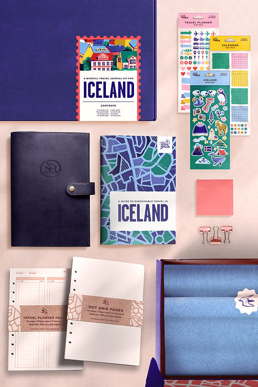
Each kit contains a binder-style journal base which can be filled with various kinds of page inserts, such as practical organizational tools like calendars, budgeting, and itineraries, as well as freeform journal pages. This allows the user to fully customize their planner for their organizational needs. In addition, the journal base can be reused for future travels, reducing paper waste and offering a more sustainable option than a typical notebook. Peregrine’s travel journal kits are each tailored to a specific destination and include a useful and practical travel guide which informs the user on how to travel responsibly and sustainably in that destination.
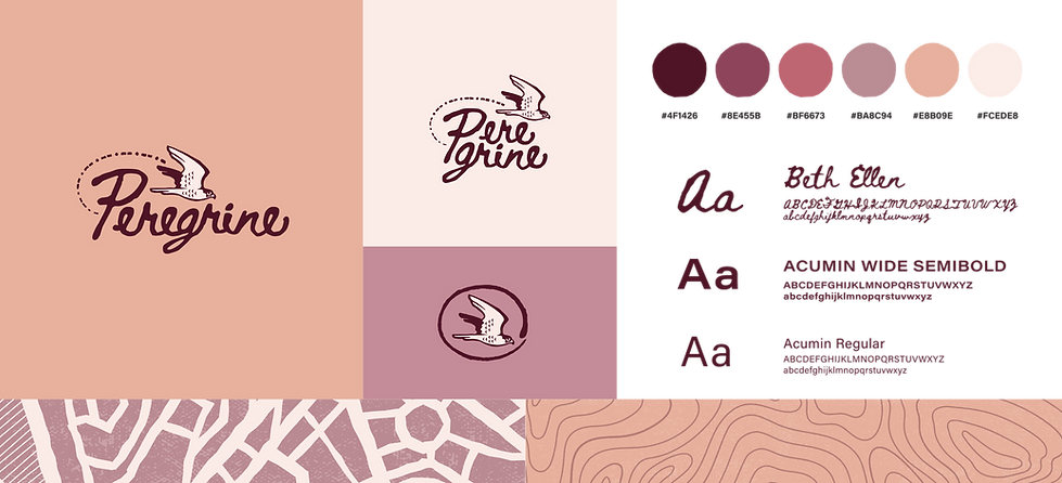
Logo & Branding
I decided on the name ‘Peregrine’ for my brand. The word peregrine comes from a Latin word meaning “to wander”. Peregrine falcons are known for migration. I am using the falcon here as a symbol of connection to the environment and to invoke a sense of adventure in the user.
he final iteration has a refined falcon symbol and three different orientations: a horizontal orientation (the primary logo), a stacked version, and an icon version without text. The branding for the company has its own color palette while the individual kits have their own color scheme.

Travel Guide
I focused my attention on one country (Iceland) so that I could gather specific information about what it means to travel sustainably and ethically there and use that information to write an example of one of the travel guides that would be in the journaling kits. I aimed to create a distinctive look for the guide which would be associated with the brand. My intention was to strike a balance between fun and function; I didn’t want the images and style to overwhelm the content but I also wanted the guide to be much more fun to look at than a typical travel guide.
Illustrations
I created several illustration for the travel guide pages. I opted to use illustrations rather than photos to remain consistent with the visual direction of the travel guide. This process was time consuming but ultimately I think it ended up making the travel guide unique and visually appealing. Here I also took the opportunity to include some elements that I enjoyed in my logo ideation but ultimately left out, such as the stamp border, in order to expand on the visual language of the brand. The art style I chose is inspired by vintage travel posters and risograph illustrations with distinct separation between objects.


Travel Journal
After analyzing existing brands and survey of potential users, I decided that the most effective structure of the journal itself would be a small ring binder. The user can purchase packs of pages and use only what they need, and the base of the journal can be reused for future travels.
hoped to find a balance between a guided planner and a customizable one. Through my research I also learned that when planners are too heavily designed, people are more likely to stop using the after a while. Therefore, I tried to keep the design as minimal as possible while still offering some structure.